Market Fresh
Simplifying meal planning and delivery with a user-friendly and accessible interface.

Challenge
Market Fresh faces the challenge of distinguishing their meal kit subscription from standard grocery delivery in an already crowded market, aiming to leverage their unique position to attract both new and existing customers.
Impact
We successfully increased user traffic and engagement from 10% to 27%, significantly enhancing overall interaction and reach.
Solution
Deliver a user-friendly platform that combines recipe curation with convenient ready-to-go meal options.
UX Methodologies
Stakeholder Interviews
End-to-End UX
User Research
Usability Testing
Wireframing
Mockups
Prototyping
Timeline
Oct 2021 to Sept 2023
Tools
Figma
Miro
Flowmapp
I conducted stakeholder interviews to learn more about the business needs
Need to determine:
The best way to collect customer orders.
The range of offerings, focusing on lunch.
Pricing and willingness to offer different services.

It's no wonder that the meal kit subscription business model is popular, as it appeals to a wide range of demographics in the competitive market.
Key observations:
Meal kit services can also function as recipe websites
Lack of dietary diversity needs
Some lack of ability to customize
Tailored to couples and families; not individuals


Competitive Analysis & Potential Opportunities
Opportunities
Address more dietary needs
Ability to curate both recipes & ready-to-go meal kits
Increase in add’l services to neighborhood (curbside, pickup, delivery)
Provide recipe + grocery list subscription (in-store) vs. meal kits (delivery)
User Surveys
53% rarely used meal delivery services
57% dietary restrictions to consider
57% normally spend $6-15 for lunch daily
User Interviews & Insights
User prioritized time, price and health
Women more willing to spend on quality
Users more interested in meal curation, however quick and efficient esp during week days - tend to be busiest
User Personas
Based on the results, I created two user personas to gain perspective and empathize with end of users. This helps visualize the type of person utilizing Fresh Market

Martha
on-the-go working mom
“I want to be a good role model for my kids that a healthy eating lifestyle can be quick and fun. However, how can I do that if I don’t eat healthy myself?”
Goals
Healthy, quality meals for busy lifestyle
Keep her blood pressure and cholesterol numbers in an adequate range
Spend more quality time with family on the weekends
Frustrations
Tight family budget due to husband losing job over pandemic
Constantly picking up food on the way home which negatively affects health and impacts daughter’s fitness goals for volleyball
Husband makes boring meals due to lack of knowledge/skill with cooking

Adam
“I love my fast paced lifestyle from my job to my social life. However, it leaves very little room to stay track on with my healthy eating.”
Goals
Healthy meals and snacks that can last during his 12 hour shift and keep him full
Track calories and macros easily to stay on track with fitness goals
Fresh meals with variety and flavor to keep him healthy diet interesting
Frustrations
Meals that last for the 3-4 workdays so he doesn’t have to cook when she gets home and eat unhealthy food at work
Having groceries spoil due to his busy schedule and maxing out his eating out budget
Sometimes eats the same meals daily/weekly due to lack of creativity and busy schedule
User Stories
I divided user stories into two categories: one for new users and one for returning users. Based on my research, I selected the most important stories to create user flows. By capturing product functionality from the user's perspective, this user-focused framework helped identify and retain the product's value.

Story Mapping
Story Mapping compelled me to prioritize actionable items differently, highlighting their importance. It displayed the iterative arc of visual solutions and helped break down my user flows, allowing me to better understand the necessary components to build the product.

Priority Guide
Writing a Priority Guide revealed the scope of the Fresh Market product and highlighted the areas needing the most attention for user testing. With the user in mind, I concentrated on crafting content with the appropriate language and tone. Additionally, I incorporated microcopy to account for potential user errors.
Section label
Associated content for section
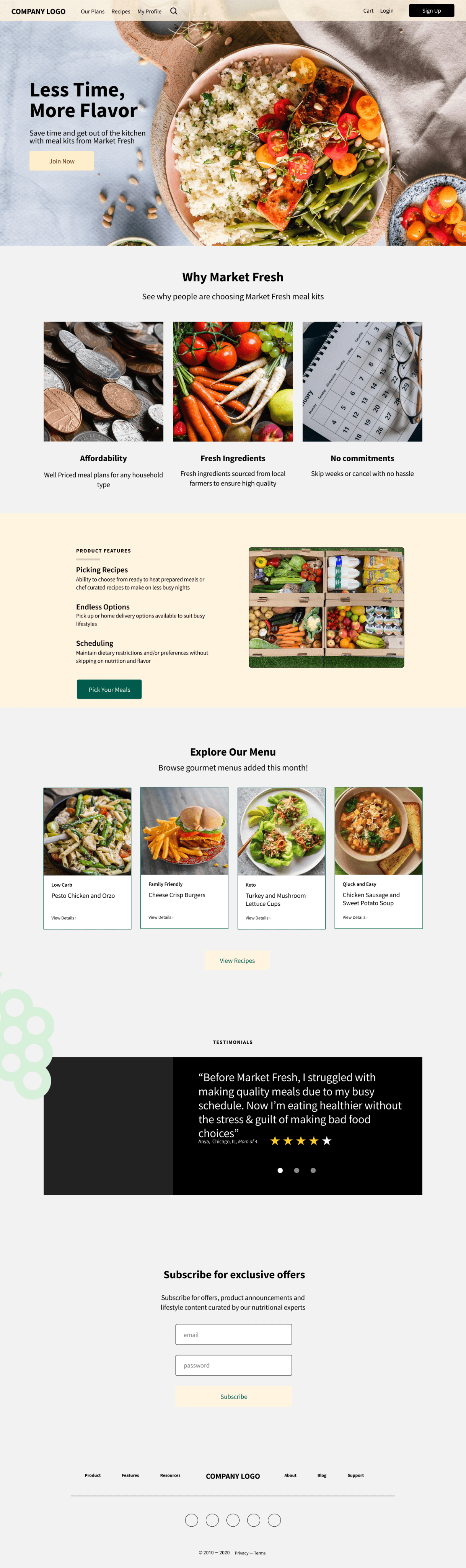
Why Market Fresh
>Affordability
(image of pennies/change - text underneath)
Well Priced meal plans for any household type
>Fresh ingredients
(image of fruits/veggies)
Fresh ingredients sourced from local farmers to ensure high quality
>No committments
(image of calendar)
Skip weeks or cancel with no hassle
Product Features
>Picking recipes
Ability to choose from ready to heat prepared meals or chef curated recipes to make on less busy nights
>Scheduling
pick up or home delivery options available to suit busy lifestyles
>Endless Options
Maintain dietary restrictions and/or preferences without skipping on nutrition and flavor
>CTA button
Pick your meals
Explore our menu
-Browse gourmet recipes just added this month
pictures of meals (meals labeled with preferences: keto, gluten free, etc)
left and right arrow that allows users to see more meals
>CTA button
View Recipes
Reviews
Quote
“Before Market Fresh, I struggled with making quality meals due to my busy schedule. Now I’m eating healthier without the stress & guilt of making bad food choices” - Anya
4 stars shaded out of 5 stars below review and name
can include location next to Anya’s name
possibly include lifestyle like “mom of 4”
Subscribe for exclusive offers
Subscribe for offers, product announcements and lifestyle content curated byour nutritional experts
Terms & Condition
FAQ
Customer Support
Careers
Follow us
social meal (FB, IG, twitter)
Section label
Associated content for section
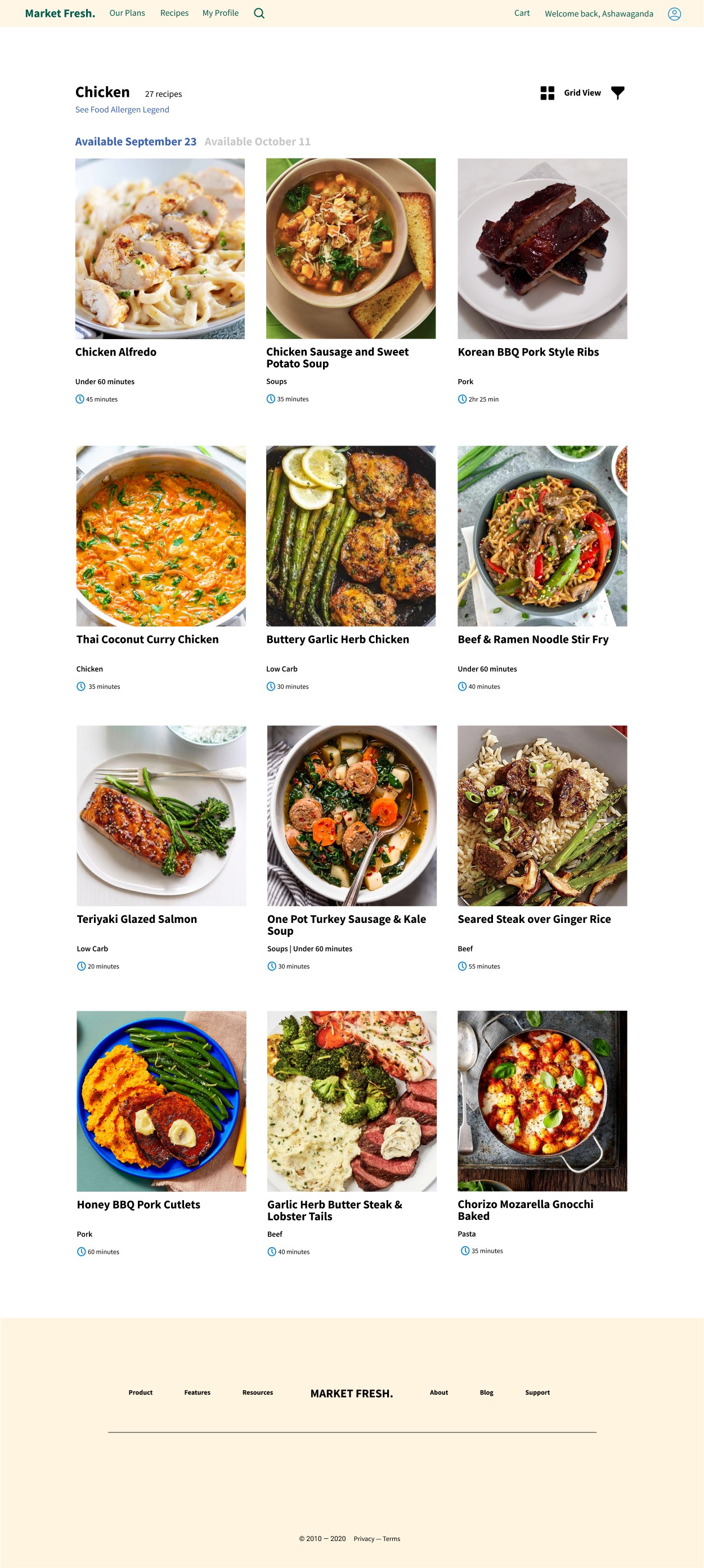
Search Results
word that was typed: Chicken
25 recipes
pagination of 10 per page
option for list view or grid view
CTA button
Sort by
drop down of popular & newest
Refine
dropdown categories (expands)
dietary preferences
cooking time
protein
meal type (breakfast, lunch, dinner)
calories and/or macros
dish availability
Recipe Images
3-4 pictures in a row
-Picture of chicken Alfredo
-Chicken Alfredo in bold; cooking time below name
-dietary icon symbols: chicken, contains dairy, (when hovering, includes text)
-Tag on image: quick & easyrecipe,
-dish availability: ex: Oct 1-7
Section label
Associated content for section
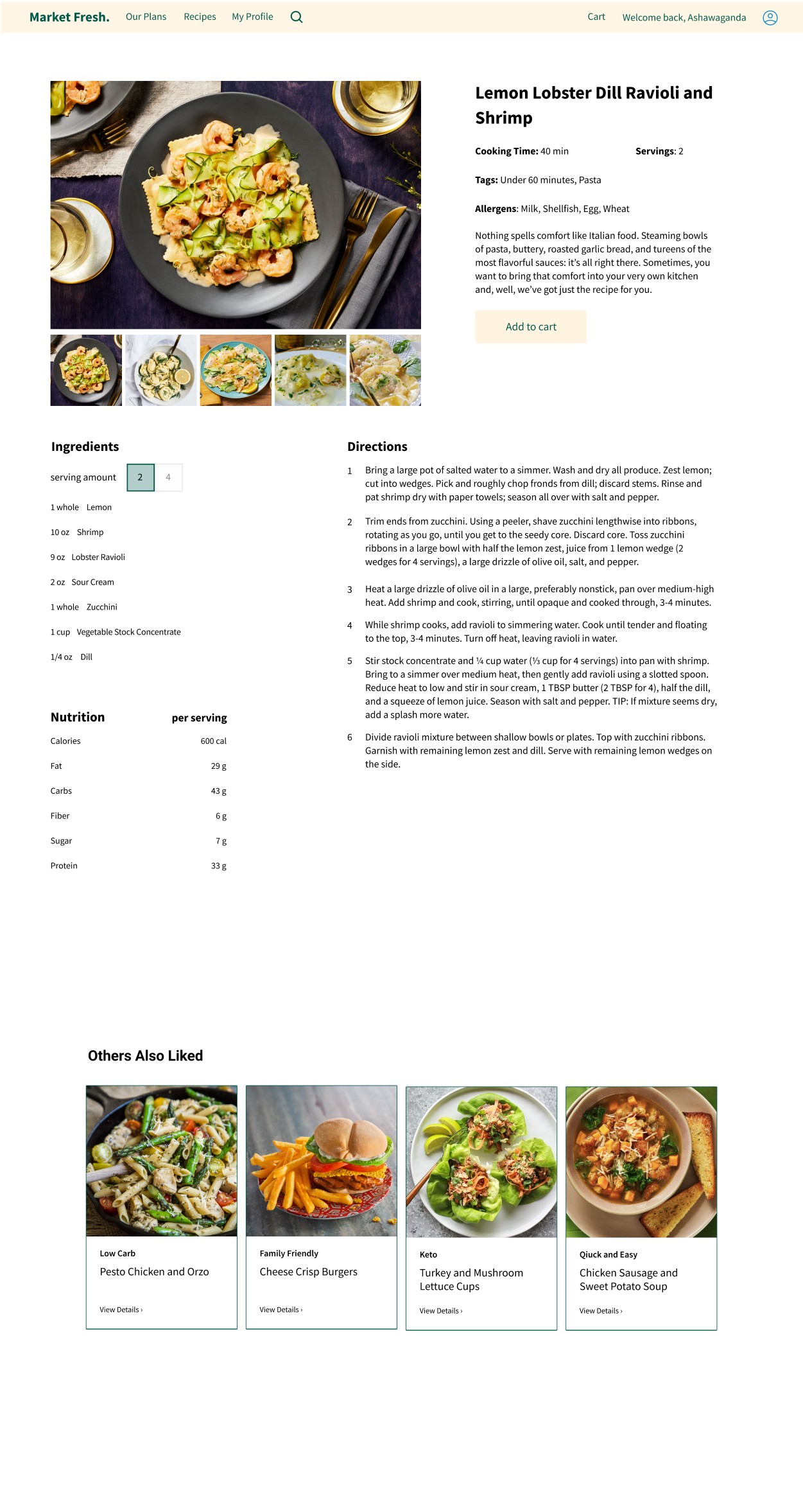
Dietary label
(example: vegan, gluten-free,etc
Ingredients
per serving amount
ability to change serving amount which adjust # of ounces, teaspoons, table spoons, etc
picture of ingred
Nutritonal Value
-per serving size
-caloric information include
CTA button
View full nutrition
when clicked either popover of nutrtion or exapands
CTA and or link for alternative recipe button
-altetnative options included
option to change specifc recipe
Recipe Instructions
number bullet format
Picture of meal
Description Pgh
Nothing spells comfort like Italian food. Steaming bowls of pasta, buttery, roasted garlic bread, and tureens of the most flavorful sauces: it’s all right there. Sometimes, you want to bring that comfort into your very own kitchen and, well, we’ve got just the recipe for you.
Recipe Info
time: 40 min
dietary/allergy icons if include
when hovering, text appears
servings: 2
cooking difficulty: easy
Allergens (if applicable)
example: soy; what)
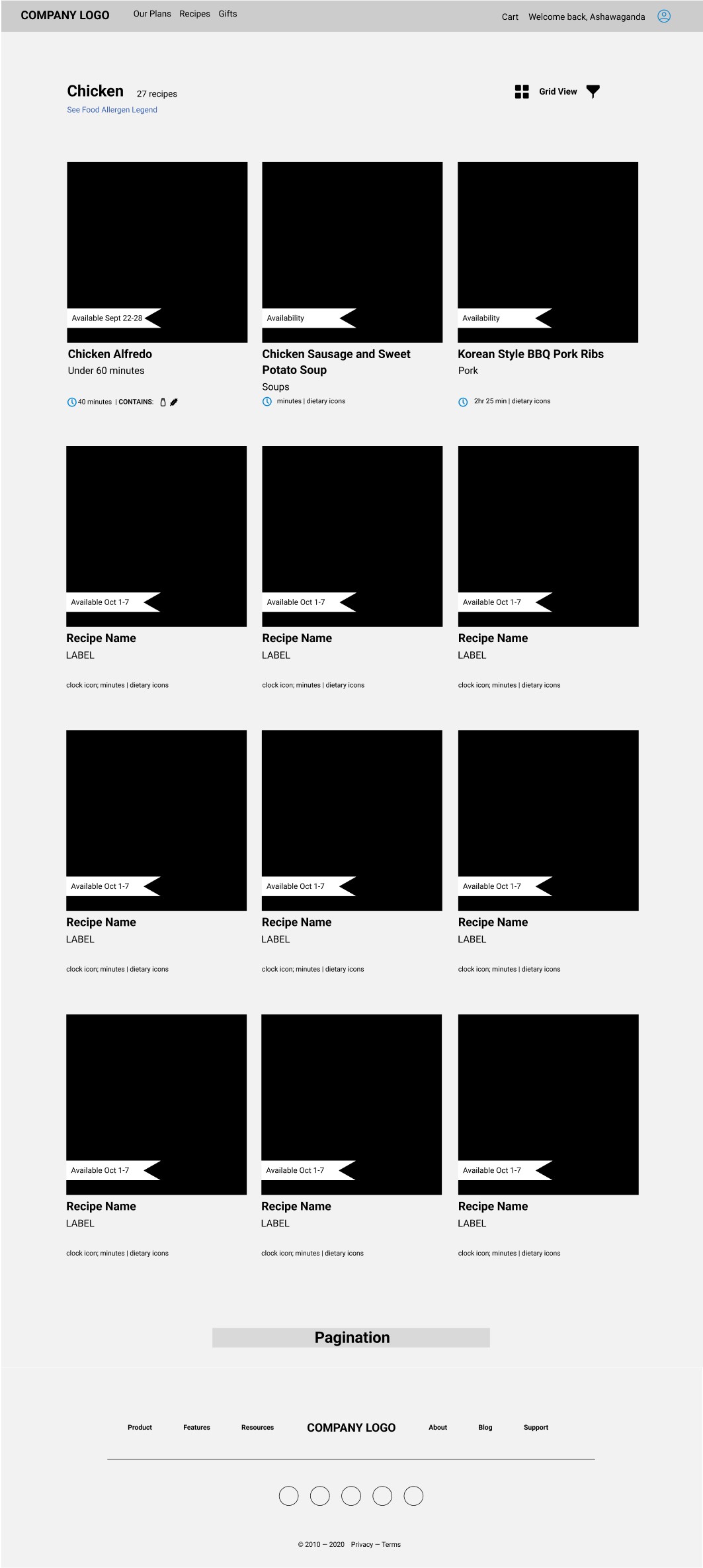
Wireframes
I first dedicated to show case recipes on the homepage with a carousel image.
I want to have a sections displaying 3 main product features and separate section that depicts why users should choose Market Fresh.


Design Version I
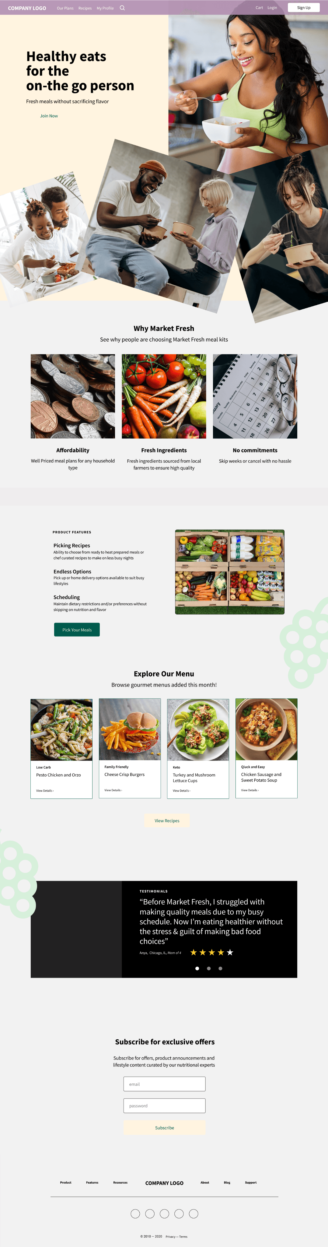
I added a visual foundation through wireframing. My initial goal was to convey a sense of family and community on the home landing page, though the color choice needed refinement.

Usability Testing
I created multiple iterations and conducted usability studies to narrow down the preferred design.
64% liked image with the food i.e. option A
Option A
Option B
Option C

The high fidelity design for the recipe website features a clean, intuitive layout with visually appealing imagery and easy-to-navigate sections.
Final High fidelity
Branding
I worked with the marketing team to select branding colors that embody the company’s values. Dark green color was chosen as an accent color on the home screen. Green indicates healthy, food, vibrancy, and freshness.
The team decided on a neutral primary color to give balance.
Maintained one type font using different font weights for hierarchy and differentiation

Lessons Learned
People expect free shipping, customizable options, and minimal upfront personal information requests.
User trust is crucial, especially when money is involved; clear explanations and intuitive design are necessary.
Time is valuable; users want quick, effortless interactions and minimal decision-making for daily tasks like meal planning.