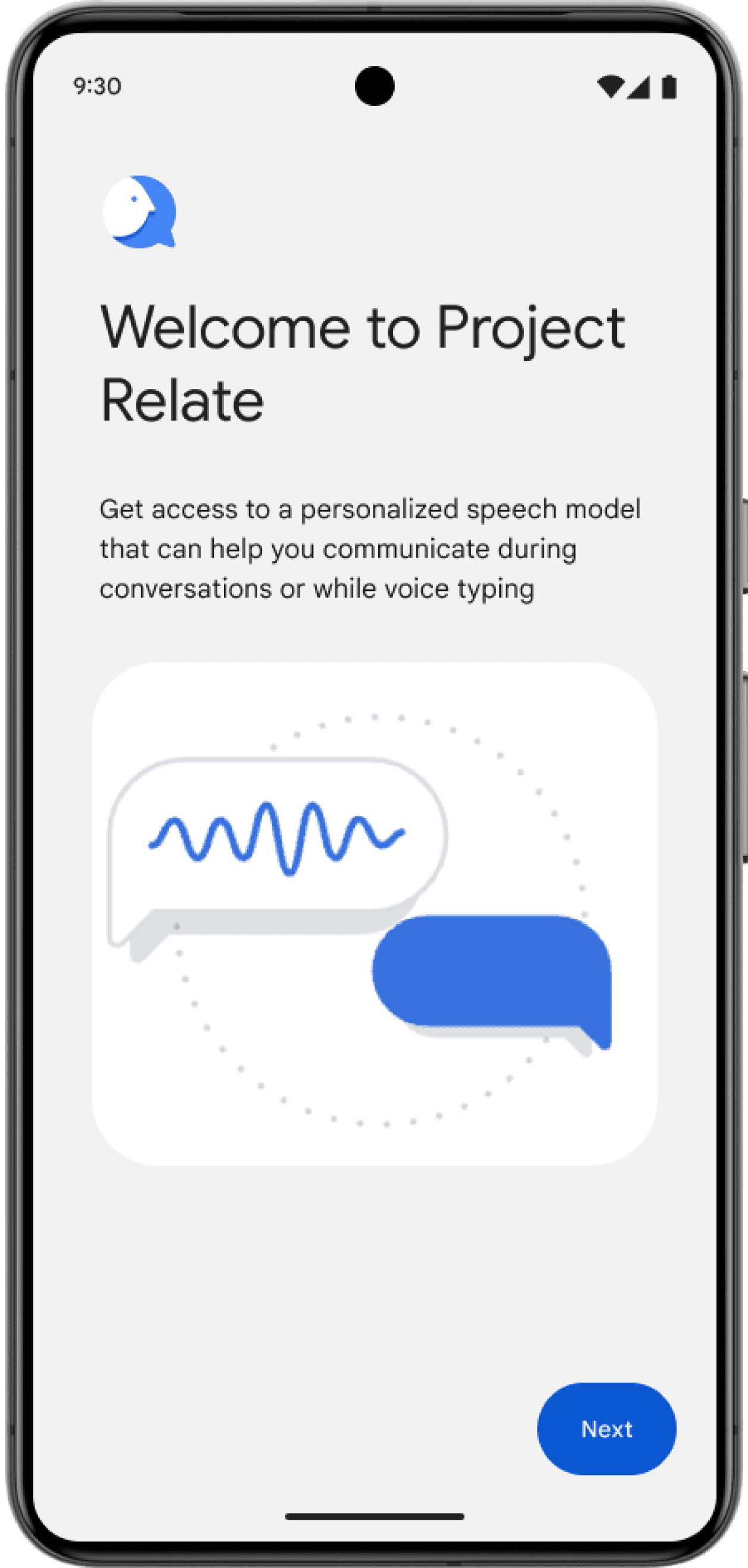
PROJECT RELATE ONBOARDING
Improving usability to make a confusing beta
app intuitive and accessible.
Challenge
User abandonment and a lack of understanding of the app's product value were barriers of user engagement
Impact
Highlighted in the Accessibility portion of Google I/O, May ‘24
Solution
An onboarding sequence was implemented to lower churn and enhance user growth.
UX Methodologies
User Research
User Journey
Heuristic Evaluation
Wireframing
Mockups
Prototyping
Tools
Figma
Timeline
Oct 2023 to Aug 2023
View summary
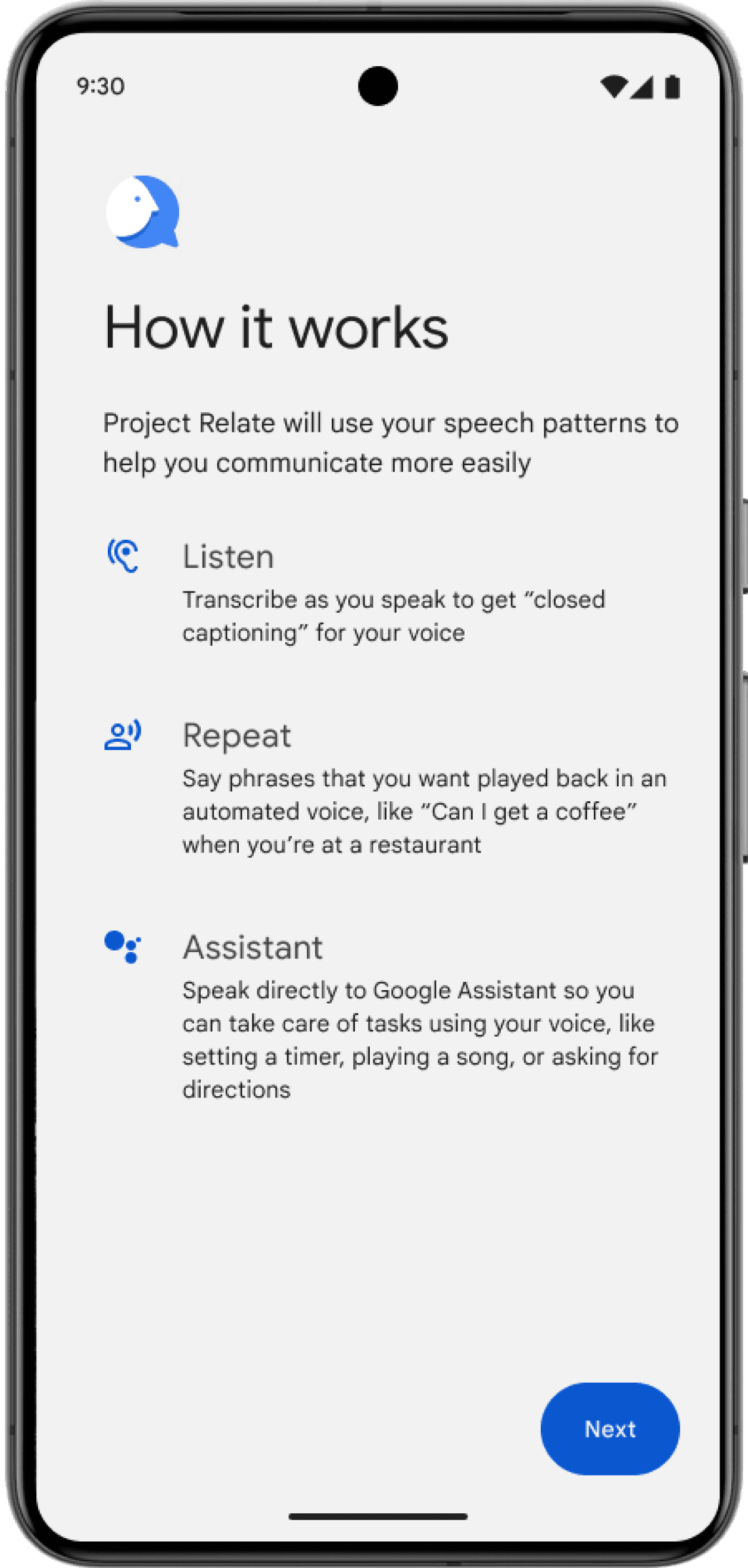
About the app: Why do people use Project Relate?
People with atypical speech face many challenges:
1
Difficulty communicating with people and voice recognition devices
2
Having trouble being understood by others
3
Being dependent on caregivers to relay their messages
What is Project Relate?
Project Relate is an app backed by machine learning that allows users to communicate easily and independently with others while having access to Google Assistant.

Challenge
How might Project Relate improve usability and provide product value for their user?
Project Relate was an Engineer driven app that lacked UX insight and analysis.
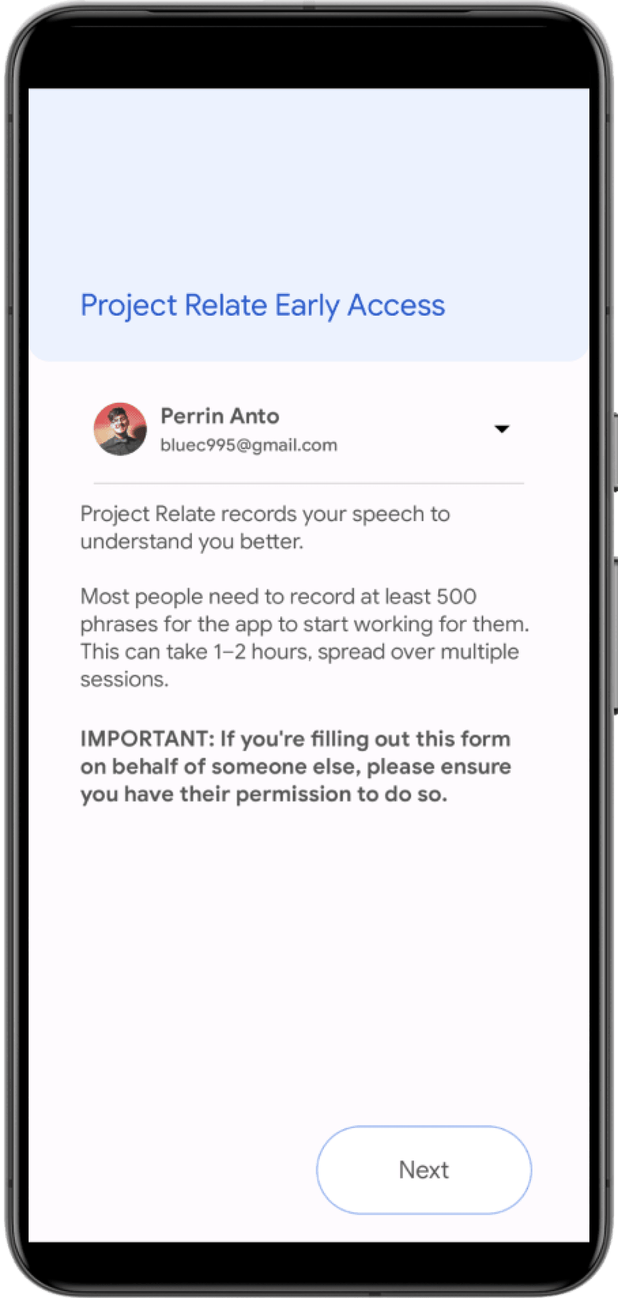
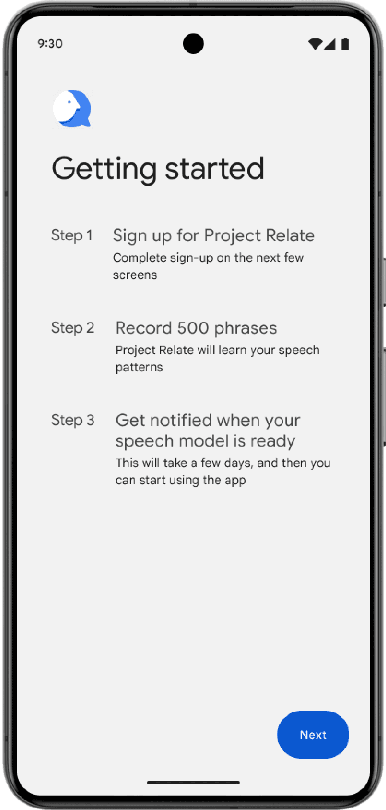
Imagine having to record 500 voice samples but not understanding the benefit
1
User goals
See the app’s benefit
See the feature differentiation
2
Business goals
Grow user base
Retain existing user
Gaining clear understanding of speech workstream
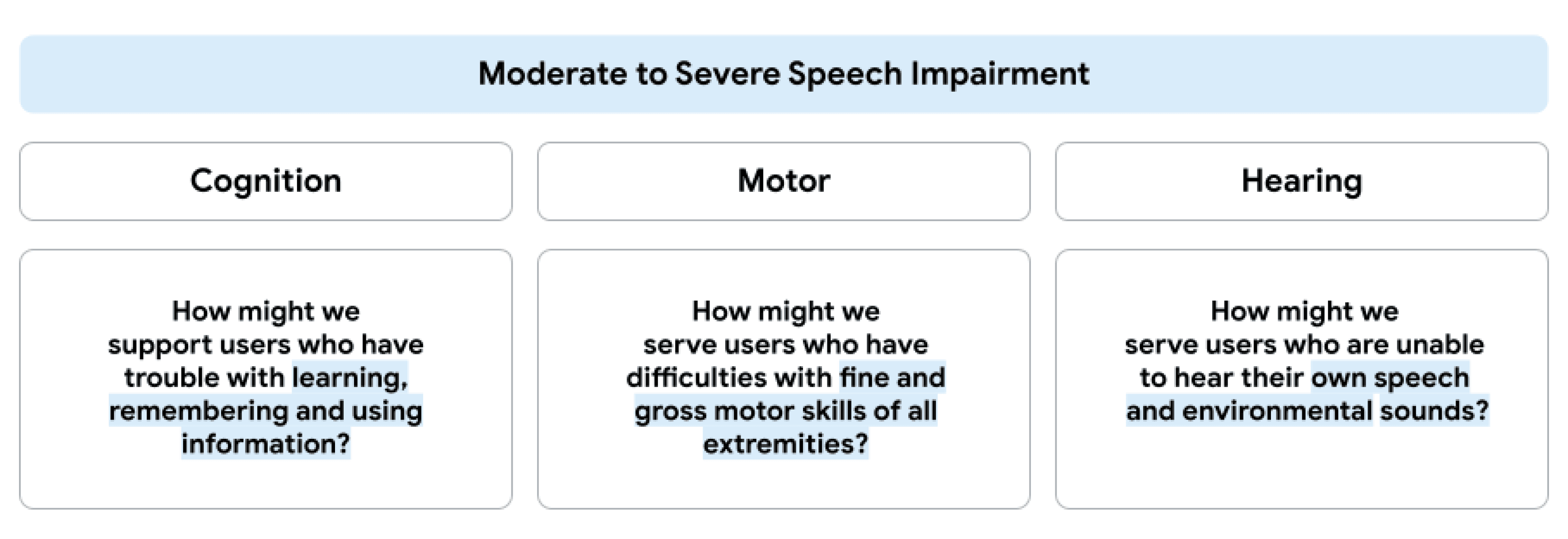
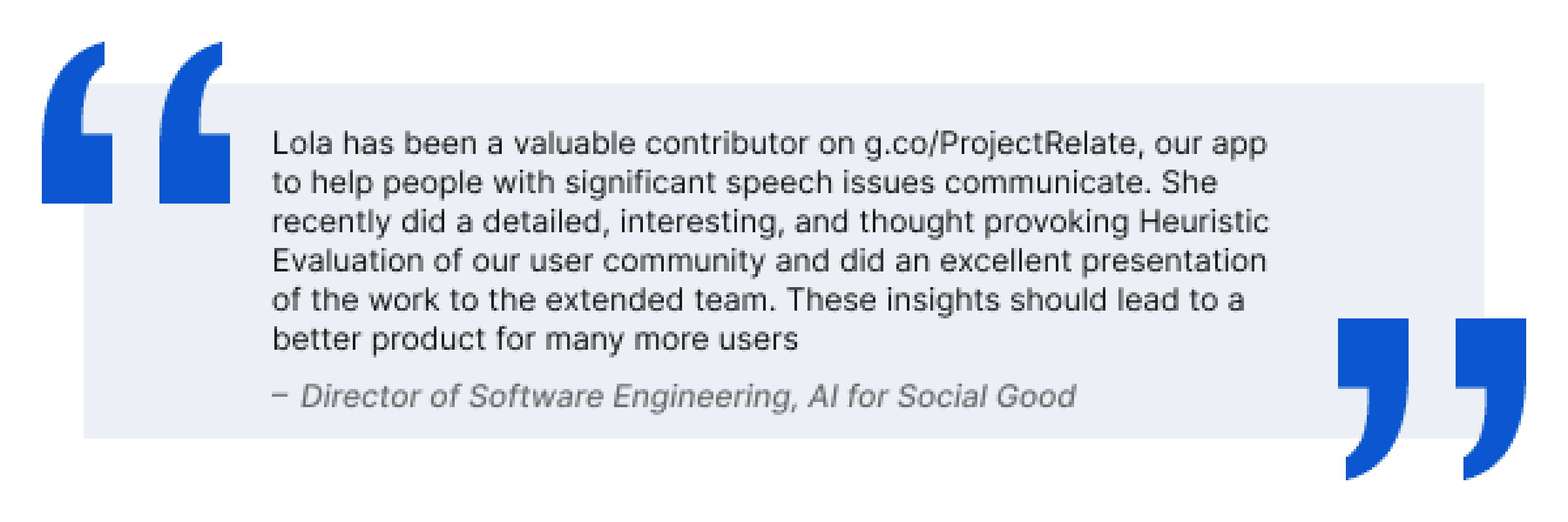
Missing UX support led to limited user understanding. We realized users with really strong speech difficulties often have other challenges too.
Brainstorming user journeys for alignment
I led a brainstorming user journey workshop to unlock user needs among the impairment specific group. Outcomes aligned the team and direction.


Discover
Addressing usability needs and proposing design solutions
I completed a product audit, identified key improvement areas and proposed design solutions.


Research review
A thorough review of the SLP research revealed user feedback highlighting further issues. To gain a deeper understanding of these concerns, I collaborated closely with SLPs / UXRs.

Users were confused...
...and we were losing them.
100%
79%
20%
17%
9%
7%
3%
Completed interest form
Invited to app
Started app
Recorded something
Recorded enough for
personalized model
Used their model
30-day active users
Let's take a look at the potential reasons for dropoff...

How might we address user pain points?
1
Explain product value from beginning
2
State feature benefits and differences
3
Provide onboarding for recording phrases
4
Re-educate on return of app
Solution
Enhance initial onboarding with feature education, highlighting benefits and differentiation. New tooltips and refresher upon receiving a personalized speech model will further solidify user understanding.
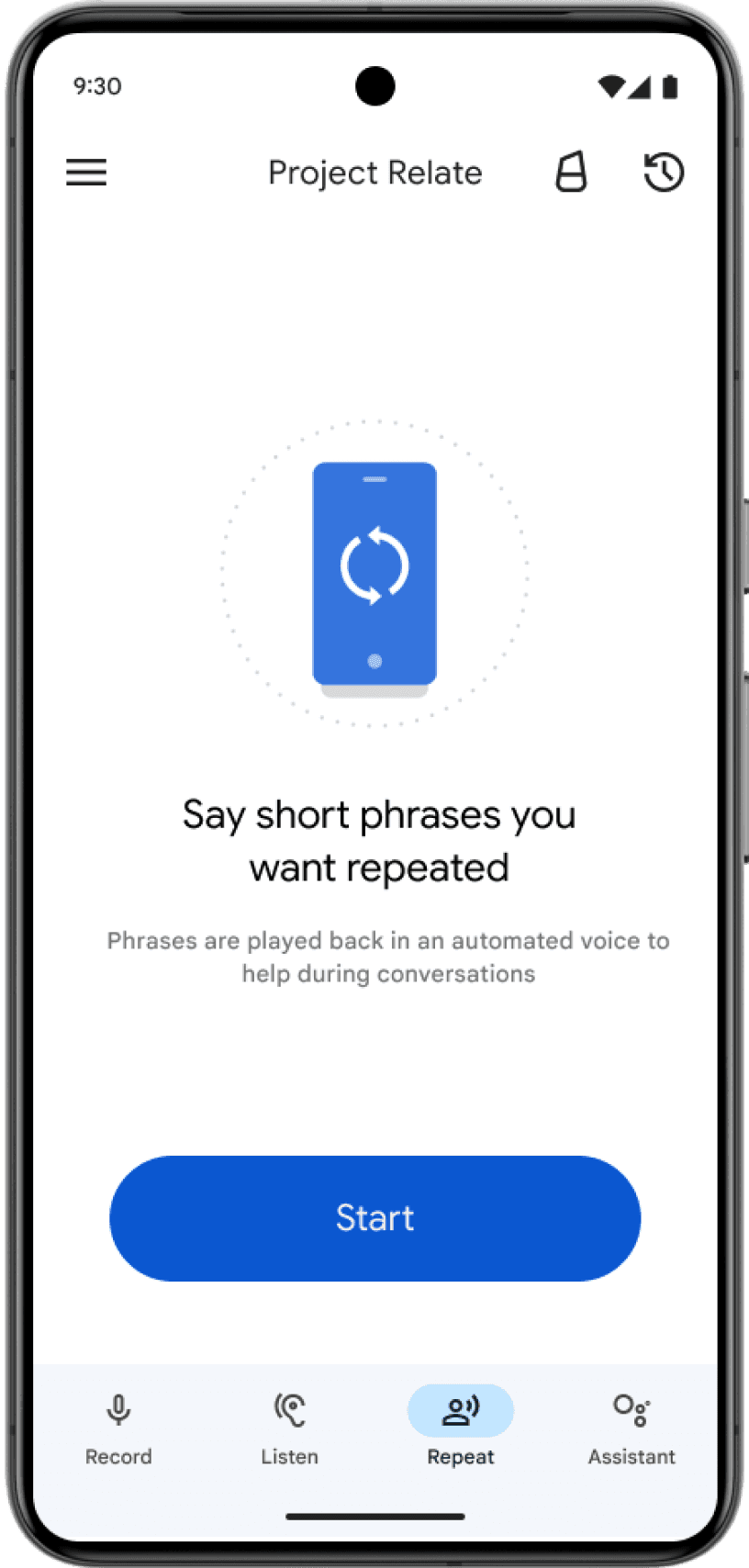
Onboarding
Re-teach
Feature education
App skips explanation and delivers confusion
Confusing auto-enrollment left users in the dark about valuable features and the personalization process. By clearly explaining features and personalization upfront, we can empower users and boost their understanding and engagement.
Previous Screens


Design iteration proposal

Feature education
Final delivery
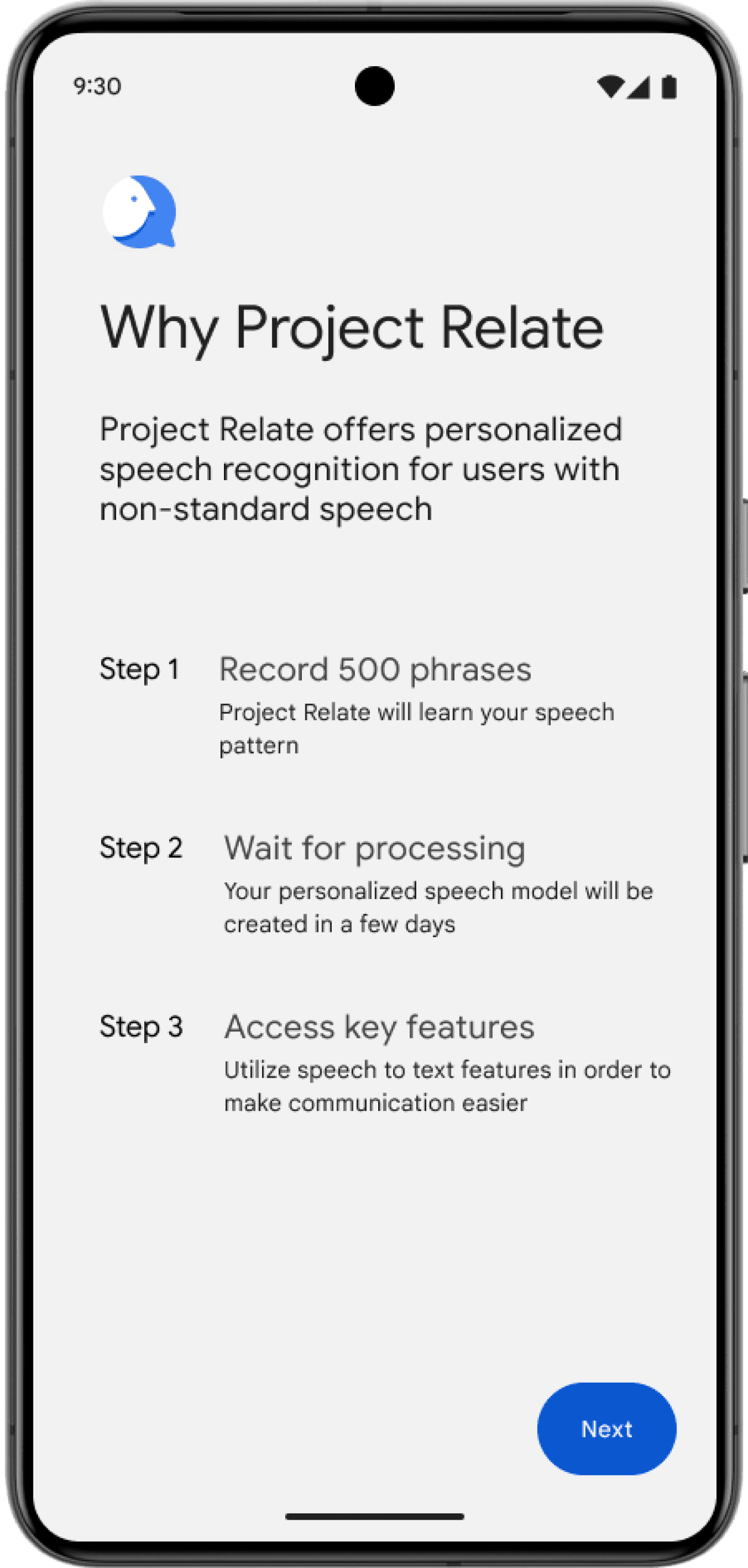
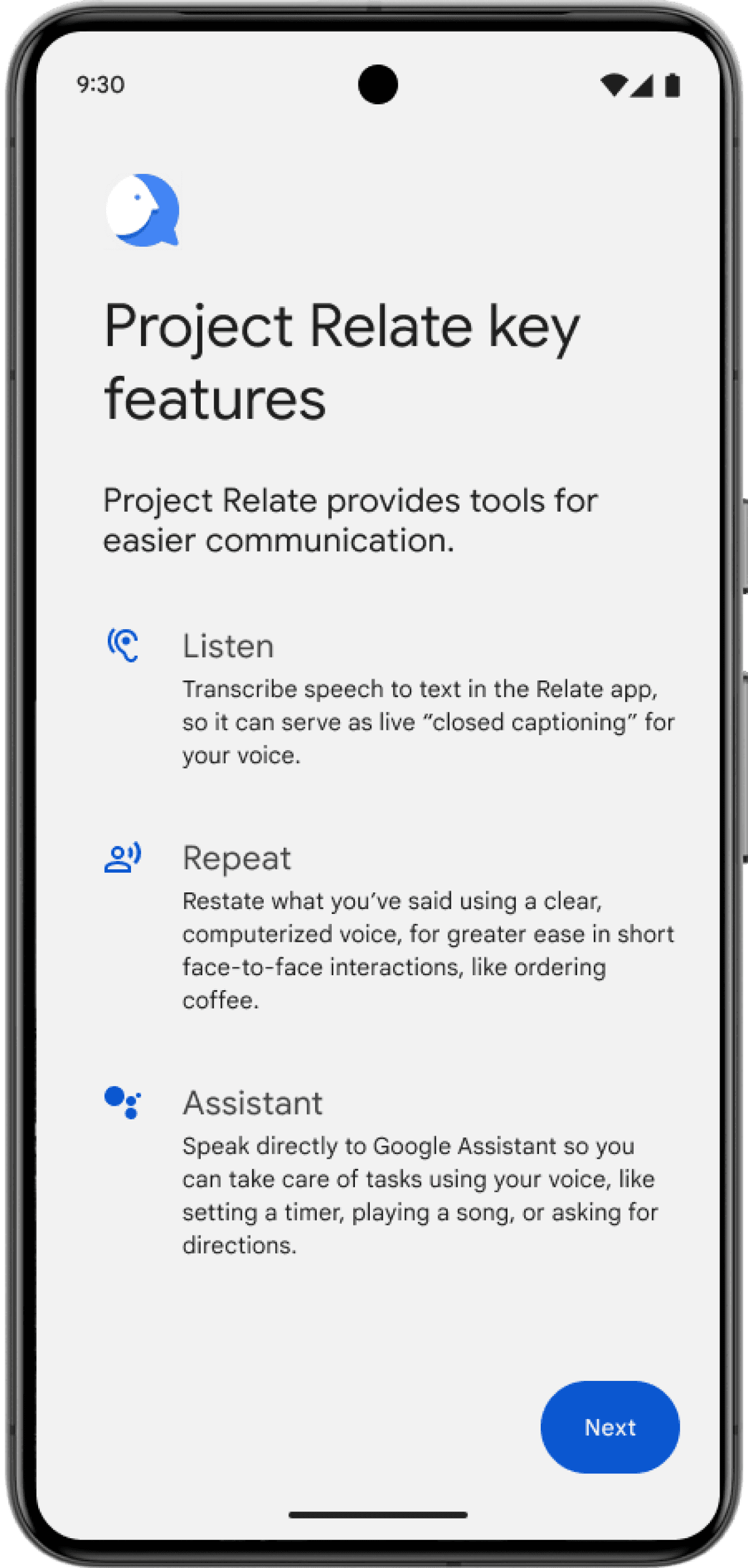
Ditching auto-enroll confusion, we empower users with clear steps and engaging visuals, igniting excitement for their personalized speech journey. Simple process, showcased value - users confidently navigate the app, unlocking its full potential.
Onboarding
Re-teach
Onboarding
Shaping the onboarding experience
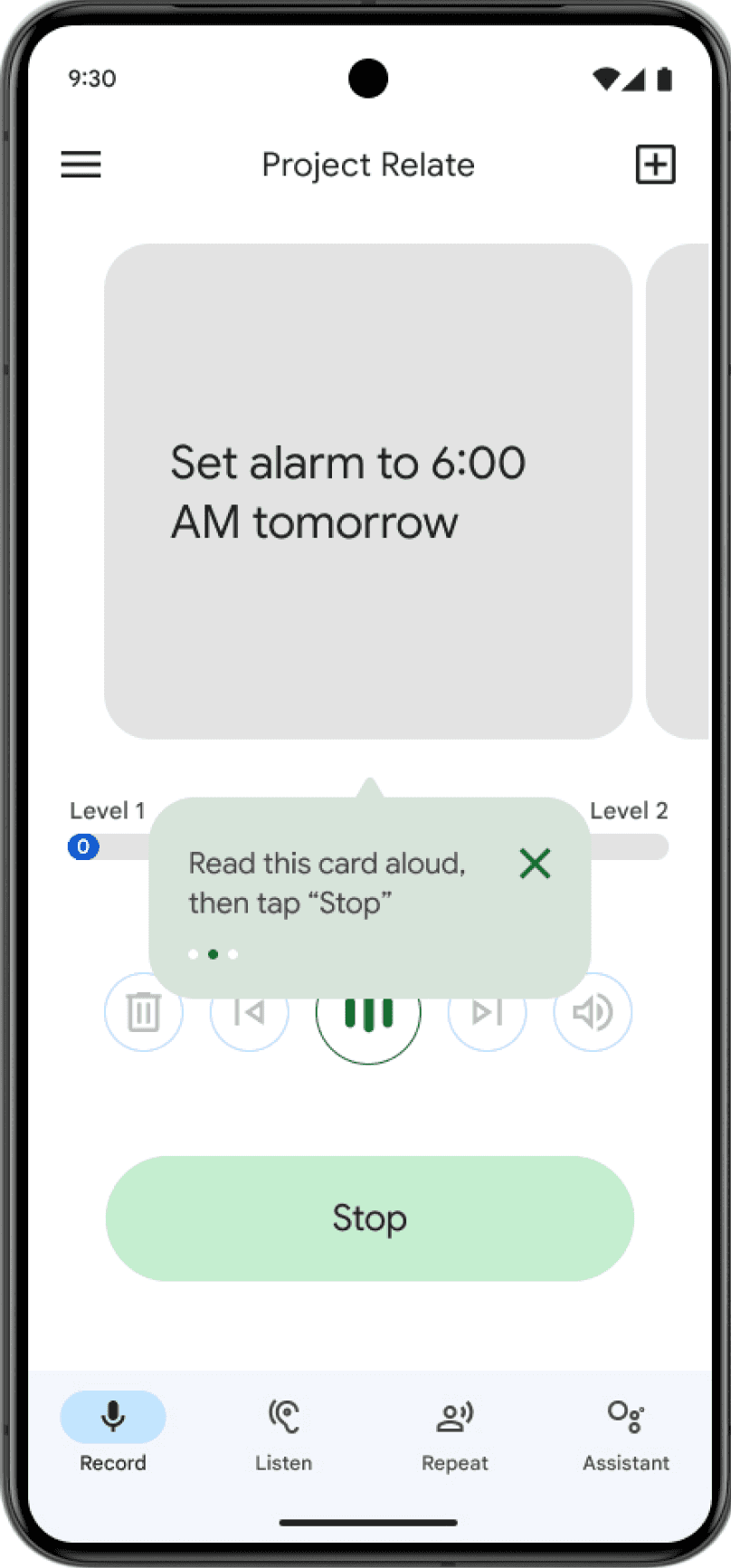
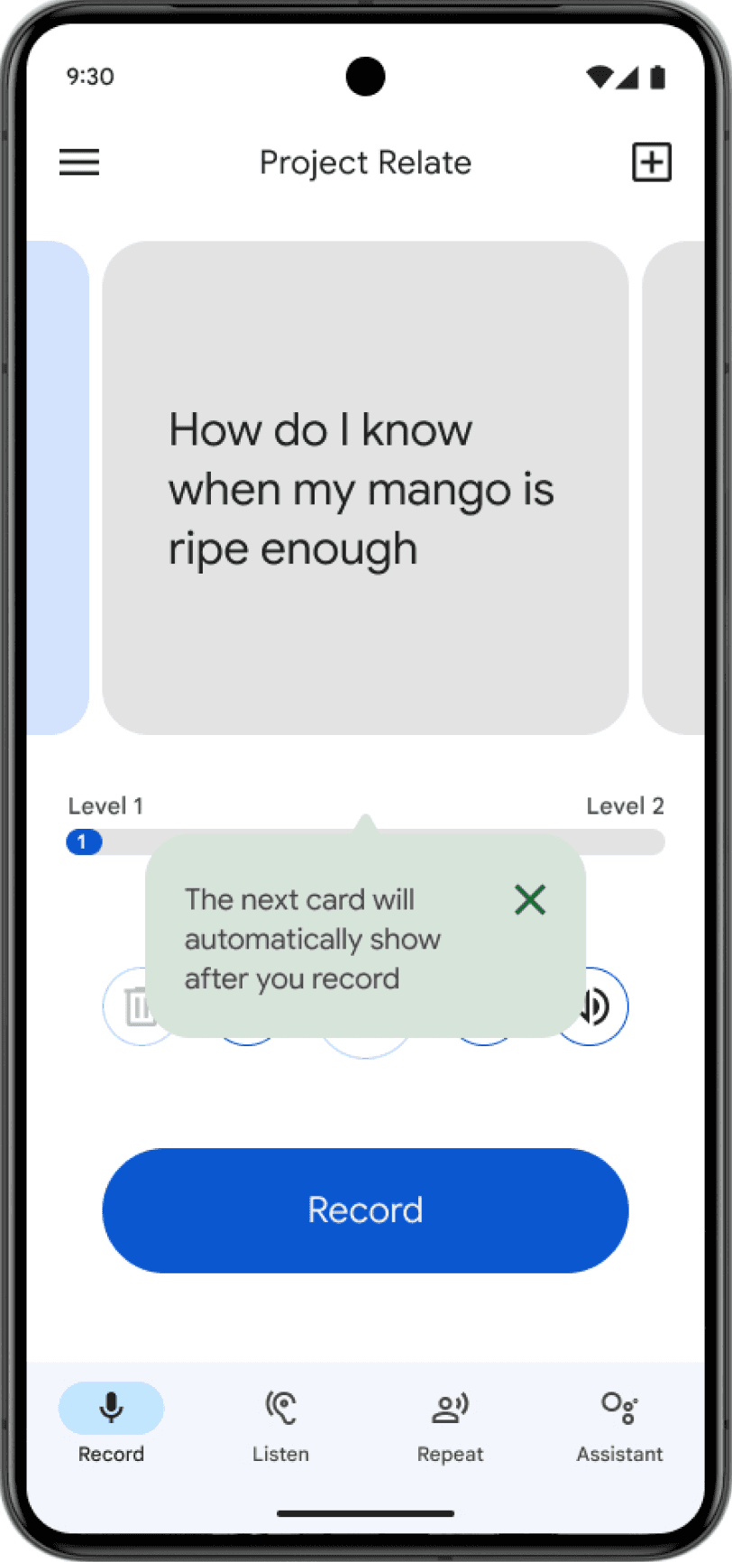
Unpacking user pain points during onboarding, I crafted a core product MVP with a step-by-step flow aligned to their mental model. Recognizing the need for user empowerment, I incorporated clear instructions and audio review, tailoring for cognitive users.

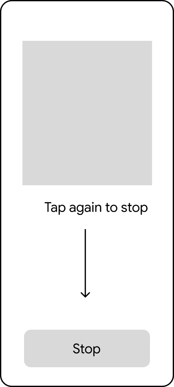


Onboarding
Enhancing usability and streamlining flow


Onboarding
Final delivery
Embracing user choice, I retained the edge case for flexible onboarding. Prioritizing readability, I removed the logo and placed a clear audio review point, further iterating on the audio buttons for easier user distinction. Collaboration with a UX writer ensured concise instructions, empowering users with a seamless and intuitive audio review experience.


Onboarding
Re-teach
Re-teach
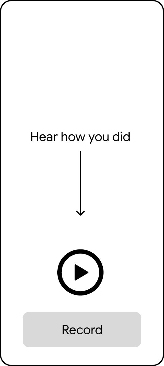
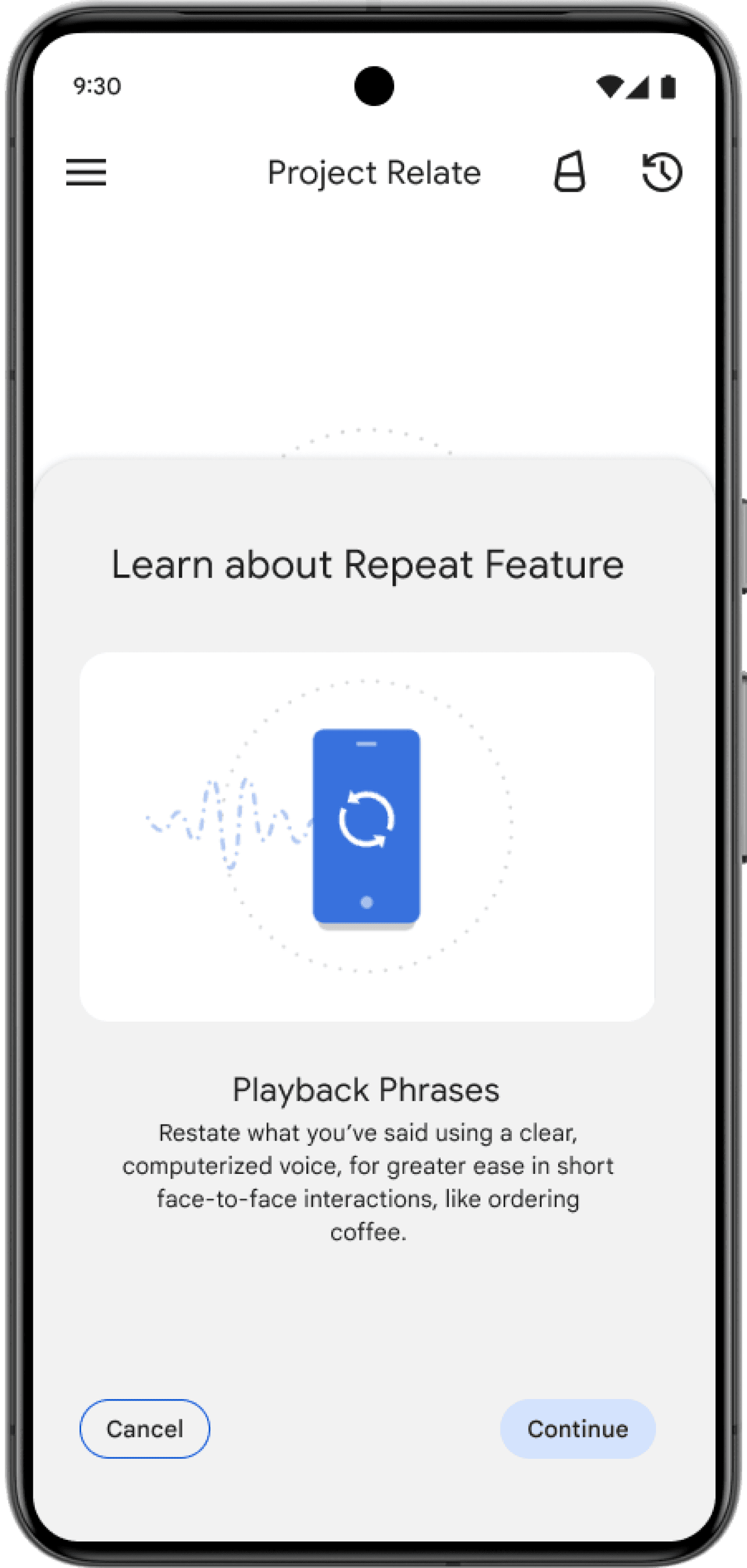
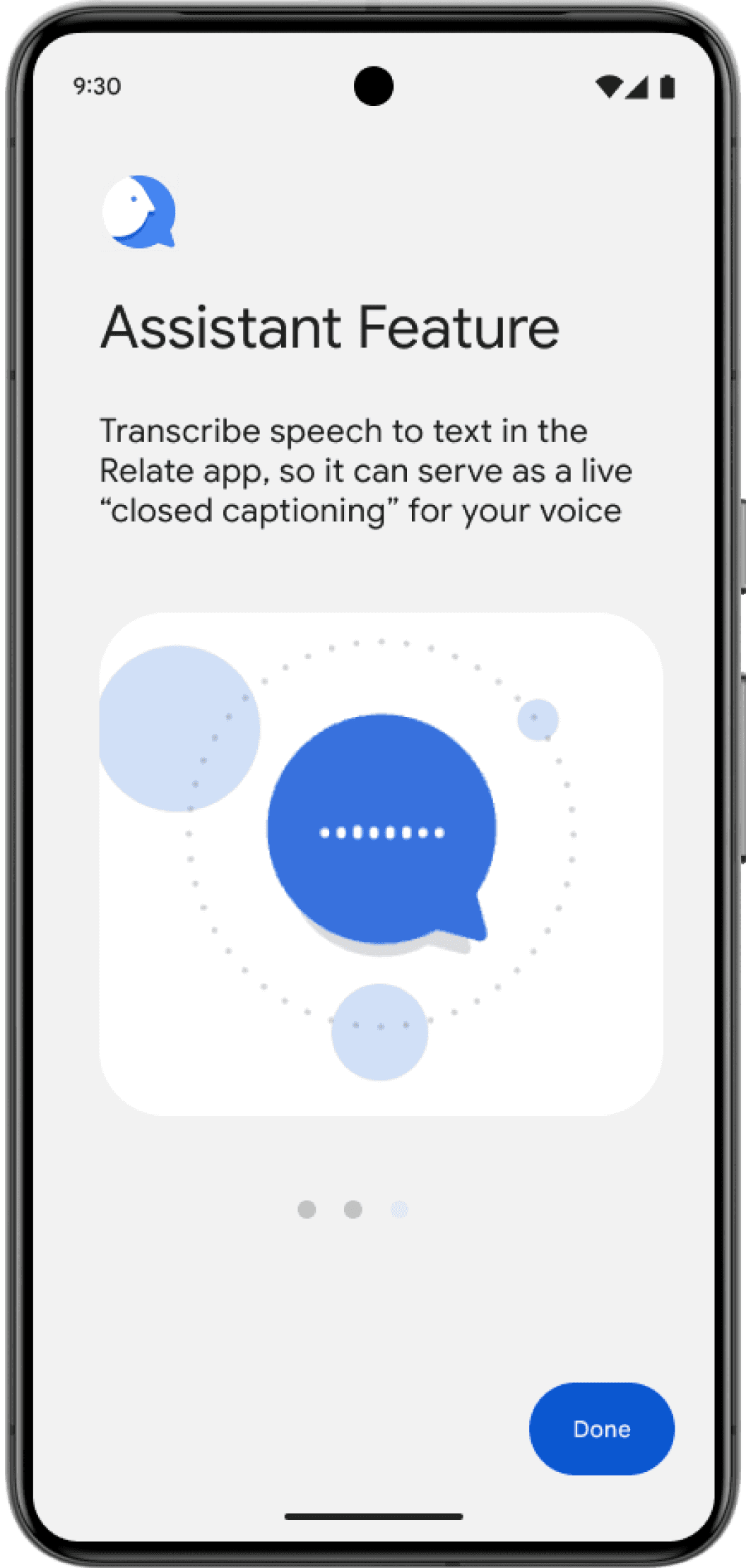
Worth the wait: Bridging the feature gap and re-engaging users
Clear "why" and anticipated features based on training data bridged the model arrival gap. Engaging feature page unveiled new functionalities, while bite-sized explanations catered to cognitive users, maximizing value discovery.
Design iteration proposal


Design iteration proposal


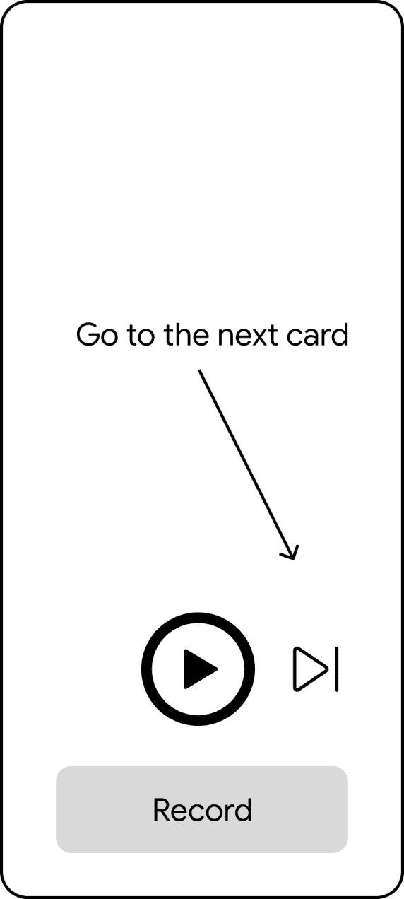
Re-teach
Final delivery
Seamless re-education bridges the training-to-model gap, empowering users to understand and utilize their personalized speech experience with confidence.


Impact
Testimonials
The new onboarding resulted in positive testimonials and feedback from internal employees.


Impact
Google I/O
It was also highlighted at Google I/O, an annual developer conference in May 2024. [timestamp 1:55]

Next Steps
Collaborate with marketing team for GM3 campaign to inform new and existing users
Launch user testing for feedback and insights of usability compared to GM2
Concept design of feature improvement
Lessons Learned
Consider edge case uses case
Provide concise step-by-step onboarding process to build and prepare users' mental model